How One Graph Explains 50 Years of American Economics
- rahul allala
- Mar 8
- 7 min read

Updated: May 25
I want to show you something

Two lines. Blue is what the U.S. government owes, measured against what the country actually produces. Red is the percentage of Americans who can't find work, even though they're trying.
Watch them. Notice anything weird?
In the 1970s, they move in opposite directions. By the 2000s, they're moving together. Something fundamental changed in how this country runs its economy and most people have no idea.
Let me walk you through it.
First, what are we actually looking at?
Quick definitions, because they matter.
National debt by itself doesn't tell you much. $33 trillion sounds terrifying, but debt only has meaning compared to the economy that backs it up. So we use a ratio of debt to GDP.
But here's where I'm doing something a little different. The standard chart you'll see in a textbook divides nominal debt by nominal GDP, both of which have inflation baked in. instead I'm dividing real debt by real GDP, adjusted to constant 2017 dollars.
Why bother? Because nominal-on-nominal hides what inflation is doing to both sides at once. The constant-dollar version lets you compare the 1980 debt burden to the 2020 debt burden in the same terms, and it makes the 1970s look very different than the standard chart does. You'll see why in a minute.

Unemployment is the other line, and it's measured in a specific way. It's not just "people without jobs." It's people who don't have a job and have actively looked for one in the last four weeks. That distinction will matter.
The grey vertical bars are the recessions. Watch how often things break during them.
The 1970s
Let's start on the left side of the graph.
Unemployment is climbing. By 1975 it hit 8.2%. People are losing jobs, Gas lines are forming, The economy is genuinely sick.

But the debt-to-GDP ratio is falling, from around 45% to around 35%.
That should not happen. In a recession, tax revenue collapses and the government usually borrows more. So why is the debt ratio shrinking? One word: inflation.

Look at this. The 1970s were the most inflationary decade in modern American history outside of war. Prices rose about 11% in 1974. Then 11% again in 1979. Then 13.5% in 1980. Imagine your grocery bill going up by that much, year after year.
Inflation did something sneaky to the debt:
It ate the old debt alive. When you owe a fixed dollar amount and dollars are losing value, the real amount of that debt shrinks. The government was, in terms of real value, paying back less than it borrowed.
It pushed people into higher tax brackets. Tax brackets weren't indexed to inflation back then, so as wages rose with inflation, people got bumped into higher brackets and paid more. Economists call this "bracket creep." The IRS got a quiet windfall.
So on paper, the debt situation looked fine. But "fine" was hiding real pain. Real wages, which is what your paycheck could actually buy, was falling. The misery index, which adds inflation and unemployment together, hit record highs during this time.
This was stagflation:, which is stagnant growth plus high inflation, at the same time. Economists in 1970 didn't think it was possible. The precedent said you got one or the other, not both. Stagnant growth meant high unemployment, which was supposed to keep prices in check, and up until that point high inflation was a result of a lot of growth and high employment. The 1970s broke the textbook, and nobody had a clear playbook for fixing it.
There were many causes: the 1973 OPEC oil embargo quadrupled the price of oil overnight, Nixon's wage and price controls had just collapsed, the Bretton Woods monetary system had ended in 1971, and the growth in productivity had stalled. By 1979, the country was desperate for someone to actually fix this.
1980-1983
Now look at the biggest unemployment spike on the entire graph.
In late 1982, unemployment hit 10.8%. That's still the highest peak we've seen in over half a century.
What happened?
A man named Paul Volcker happened. He was the Fed chairman, and he decided that inflation had to die, even if killing it caused a recession. So he jacked up interest rates. The federal funds rate peaked around 20% in mid-1981.
This meant a 30-year mortgage in late 1981 costed over 18%. Borrowing for anything became astronomically expensive. Businesses stopped expanding, hiring froze, and people got laid off by the millions. In the end, It worked. Inflation crashed from 13.5% in 1980 to about 3% by 1983. But it came with an unimaginably high unemployment rate.
And this is where Reaganomics enters the story. Reagan won the 1980 election partly on the promise to fix this mess. His approach had four pillars:
Cut taxes, especially on top earners and businesses. The top marginal income tax rate dropped from 70% to 28% over his presidency.
Cut domestic spending, though this part turned out much weaker than advertised.
Slash regulations to free up business activity.
Tighten the money supply to kill inflation. (This was Volcker's job, who was technically an independent, but Reagan publicly backed him through the painful recession that followed.)
The theory of "supply-side economics" was that cutting taxes would unleash so much growth that revenue would actually go up. Reality was much more complicated. Economic growth did end up returning strongly after 1983, but the tax revenues didn’t reach as high as planned and weren’t able to keep up with the tax cuts and a massive defense buildup against the Soviet Union.
So the deficit ballooned.
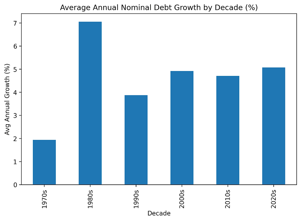
Look at this. Average annual debt growth in the 1980s was around 7% which was way higher than any other decade on the chart. Reagan nearly tripled the national debt during his presidency.
But here's the twist: notice on the main graph that the debt-to-GDP ratio didn't explode in the 1980s the way it would later, since real GDP was finally growing again after Volcker reset the system. The growth essentially absorbed the new debt.
The 1980s set up the next 15 years of expansion. But they also normalized something new in American politics, which was running large budget deficits even in good times. Before Reagan, deficits were mostly a crisis tool. After Reagan, they became a default setting.
The 1990s
The middle of the graph is suspiciously calm.
Unemployment trends down. Debt-to-GDP basically flat. One small recession in 1990-91, then nothing for almost a decade.
This was the Goldilocks economy, not too hot, not too cold. The Soviet Union had collapsed, so defense spending could come down. The internet was being commercialized. Productivity was actually rising for the first time since the early 1970s.
And then something happened that hasn't happened since, which was the U.S. running a budget surplus. From 1998 to 2001, the government took in more than it spent. Debt was being paid down.
By 2000, unemployment hit 3.9%, the lowest since the 1960s.
If you were watching this graph in 2000, you'd think America had finally figured it out. Cut deficits, grow the economy, keep unemployment low. Easy.
You'd be wrong.
2008
Watch the blue line. Starting in 2008, it does something it hasn't done in the entire chart so far.
It launches.

The Great Financial Crisis hits, which means that Banks collapse and Housing implodes. Unemployment shoots from under 5% to 10%. And the government does something unprecedented, it borrows trillions of dollars to keep the system from collapsing.
TARP: $700 billion authorized to bail out banks
ARRA: $831 billion in stimulus spending
Plus auto bailouts, Fed emergency lending facilities, and dozens of smaller programs
In two years debt-to-GDP jumps from around 60% to nearly 90%.
And here's the thing, it never comes back down.
This is the new pattern. When a crisis hits, debt shoots up. When the crisis passes, debt stays around the same until the next crisis causes it to rise again.
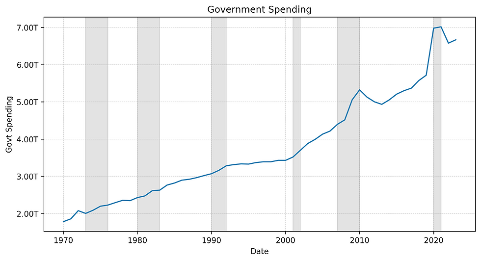
Look at federal spending. It stepped up in 2008 and never returns to the prior trend. The floor of government spending permanently rose.
2020
The right edge of the graph shows the sharpest spike on the whole chart, and that is very obvious when COVID hits. The pandemic locked down the economy and the government mailed everyone money to make it get it moving again. The CARES Act was $2.2 trillion in economic stimulus to workers and families, and PPP loans were roughly $800 billion in loans to business to help them keep employees. Unemployment spiked to 14.7% in April 2020, but unlike 2008 it bounced back, such that within two years the labor market was tight again.
However, as discussed before, Debt still followed the new pattern. It didn't bounce back. Debt-to-GDP went from around 105% to around 125% in a single year. We crossed into territory the U.S. hadn't seen since paying for World War II.
So what actually changed?
Look at the full graph one more time.
Before 1990 debt and unemployment moved independently, sometimes opposite each other. Inflation was a if not the dominant force, and high inflation actually erased debt while creating misery for everyone trying to live on a paycheck. After 1990 debt and unemployment increasingly moved together during recessions. Inflation has been mostly tame, and Instead of inflating debt away, the government takes on more debt to soften every downturn.
But neither of these come without drawbacks. The 1970s playbook of letting inflation eat the debt creates pain for everyone through eroded real wages and economic chaos.The post-2008 playbook, which was borrowing through every crisis keeps people working but accumulates debt that someone, eventually, has to deal with.

The 2010s had the lowest inflation of any decade on the chart. The 2020s are heading back up. Whether that's a blip or a slow return to the 1970s playbook only time will tell.
What I take away from this
Here's what I take away from staring at this one graph:
Debt isn't inherently bad. Borrowing during the 2008 crisis probably prevented a second Great Depression. The CARES Act prevented mass evictions during COVID, and the graph shows us that debt can be used as a tool that can save the economy and lives.
Debt isn't free either. Each crisis leaves us with a higher debt floor than before, and the Interest payments on that debt are now one of the fastest-growing items in the federal budget.
Unemployment is asymmetric. It only takes months for millions of jobs to be lost, but It takes years for those jobs to recover. The toll those years take on society is what the main reason behind every fiscal response we've seen since 2008.
The question for the next decade isn't really "Will debt-to-GDP keep rising?", because it almost definitely will. The real question is when the next crisis hits, and make no mistake there will be a next crisis, does the government still have the room to respond?
That's the fifty year conversation this graph is showing, and we should probably start listening.
Next post: Why the cost of living only goes one way (and why inflation isn't the same thing as getting more expensive).


Comments